
The ten new releases that either impressed me the most or stayed with me the longest in no particular order:
- TÁR (Field)
- R.M.N. (Mungiu)
- PAST LIVES (Song)
- AFTERSUN (Wells)
- LA CHIMERA (Rohrwacher)
- ANATOMIE D'UNE CHUTE (Triet)
- THE ZONE OF INTEREST (Glazer)
- 20.000 ESPECIES DE ABEJAS (Urresola Solaguren)
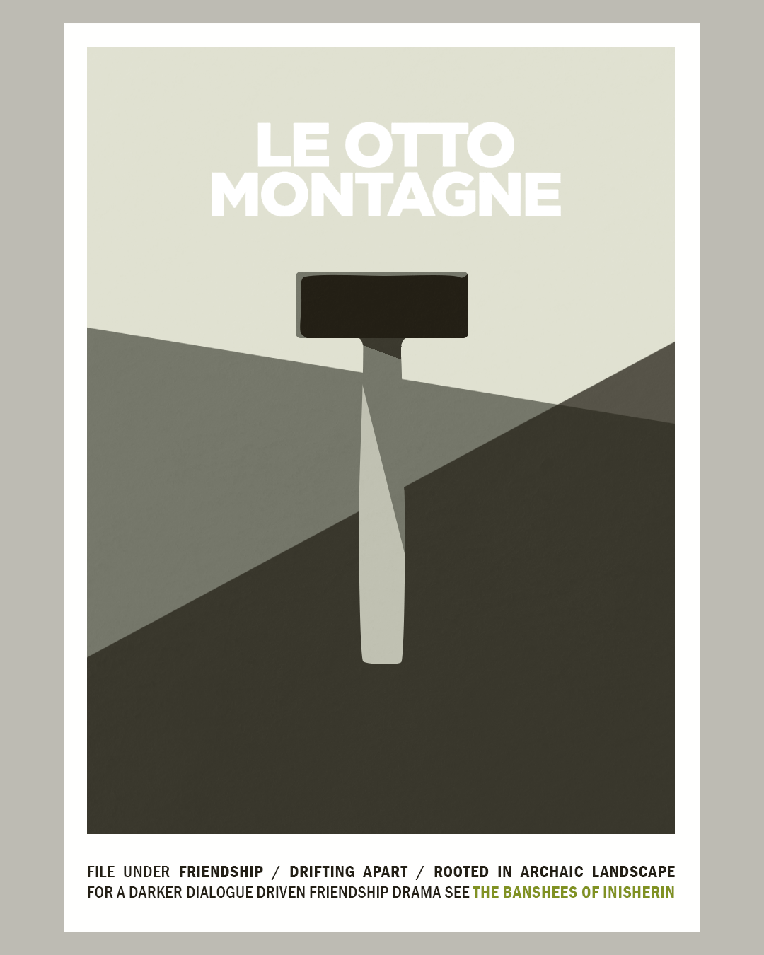
- LE OTTO MONTAGNE (van Groeningen/Vandermeersch)
- SPIDER-MAN: ACROSS THE SPIDER-VERSE (Dos Santos/Powers/Thompson)
Noteworthy Runners-Up: THE QUIET GIRL (Bairead), RETOUR À SEOUL (Chou), ALL THE BEAUTY AND THE BLOODSHED (Poitras), THE BANSHEES OF INISHERIN (McDonagh), HOW TO HAVE SEX (Manning Walker), SHEN HAI (Tian), SAINT OMER (Diop), MONSTER (Kore-eda)
I do not usually break down my film list into numbers, but Olivier Samter’s statistics inspired me to superficially dabble in that. So I find that exactly half of the films mentioned above have been directed by women (one of them co-directed with a man). Judging from the sheer amount of films I liked within the past twelve months, 2023 was a very good year. Looking at it as a cinephile in the literal sense that I prefer to see movies in a theater, it was less so. I had even prematurely claimed that it might have been my lowest cinema attendance in over a decade. But in reality, I had not thought of 2020 when canceled film festivals and closed cinemas resulted in only 49 theatrical experiences (an average of less than once a week). In comparison, I have watched about a third of the feature films I have seen in 2023 and a total of 76 screenings (including short film reels in festivals) in cinemas. Of all the streaming services, I have watched the most films on Mubi, followed by Apple (no subscription, pay per view), Disney+, Netflix, and the Swiss public-law platform playsuisse. 31% of all the feature films I watched were directed (or co-directed) by women (37.5% of the films seen in a cinema), whereas animation made up 23% (18.75% of the films seen in cinemas).
 |
In a year
when the painterly CG look definitely went mainstream, the most famous
company celebrated its 100th anniversary desperately wishing for
inspiration. But since that didn't happen, here is a mashup of the six
animated features that I enjoyed* the most in 2023, drawn in the style
of Milt Kahl (ca. 1973) |
The share of animated features was probably higher than ever because I was part of the feature film selection at the Fantoche International Animation Festival (here is a list of all the features/mini-series/medium-length-specials I have watched last year). My favorites among the new releases – those that I either enjoyed the most or that stayed on my mind the longest, in no particular order – are the following:
LINDA VEUT DU POULET (Laudenbach/Malta)
TMNT: MUTANT MAYHEM (Rowe/Spears)
SUZUME (Shinkai)
SPIDER-MAN: ACROSS THE SPIDER-VERSE (Dos Santos/Powers/Thompson)
DEEP SEA / SHEN HAI (Tian)
THE BOY AND THE HERON / KIMITACHI WA DÔ IKIRU KA (Miyazaki)
Miyazaki’s (latest) swan song also prompted me to read “How do you live?” by Genzaburo Yoshino, a touching pre-WWII novel I wish I’d had when I was a teenager.
Special Mentions go to Pablo Berger’s ROBOT DREAMS (a gentle ode to friendship without dialogue), Jaebeom Park’s MOTHERLAND (the first Korean stop-motion feature in decades, unhurried, small-scale, tactile), KNIT’S ISLAND (a documentary by Barbier/Causse/L’Helgouac’h shot inside a virtual online community), and Marjolaine Perreten’s PEBBLE HILL (a charming tv special that never talks down to its target audience of young children).
Coinciding Restorations
I have also had the pleasure to seeing two brand-new restorations of Cinderella adaptations made in 1950, both of which adhere more or less closely to Perrault’s source material (not the Grimms’ version that is more popular in German speaking countries), embellishing the narrative in their unique ways. While the Disney restoration (4K, no less) pleasantly corrected some blunders of the previous digital releases by going back to the wonderful original colors and grain structure, the uncanny image stability and the lack of an original mono mix still make it look and sound a bit frankensteiny. It’s definitely the best thing next to an IB Tech print, though.
With the Catalan version ÉRASE UNA VEZ… (Escobar/Pellicer) the pleasure was more in seeing this rarity at all, especially after an insightful introduction by one of the researchers involved in a restoration process that took eight years because all they had to work with was a beat-up black and white 16mm print. Thanks to some surviving fragments, artworks, and photograms, they attempted to digitally reconstruct the cinefotocolor version that was shown at the Venice Film Festival.
Japanese Film History
During summer, I immersed myself in the works of Satoshi Kon all over again, re-evaluating his four features and the tv series PARANOIA AGENT for two lectures one of which was part of an extensive retrospective that also included film that inspired Kon and some that were most likely inspired by his films. A special focus on the mostly fictitious film history of MILLENNIUM ACTRESS gave me a reason to finally watch genuinely Japanese classics like TWENTY-FOUR EYES (Kinoshita, 1954) with Hideko Takamine and revisit some of my favorite Ozu films, among them LATE SPRING (1949) and LATE AUTUMN (1960) in which Setsuko Hara graduates from the unmarried daughter to the mother of an unmarried daughter within only eleven years. The relationship between parents and their grown-up children had been on my mind in real life a lot in 2023, so it was only natural that this theme also stood out to me in films as diverse as KING CREOLE (Curtiz, 1958) or TALK TO ME (Philippous, 2022).
Coincidental Selectrospectives
Apart from a deliberate retrospective of Wong Kar-Wai’s partly re-cut Criterion releases, I also happened to watch quite a big chunk of Sofia Coppola’s work in 2023, seeing SOMEWHERE (2010) and PRISCILLA (2023) for the first time. The latter turned out to be a total delight, confirming Coppola as the chronicler of isolation and loneliness in a golden cage: muted, told in a mostly non-verbal style with close attention to surface details, a star-turning lead performance, and the best Elvis impersonator I have seen in a long time (maybe ever?).
After being floored by ANATOMIE D’UNE CHUTE, I finally watched some of Justine Triet’s back catalog and was surprised how interconnected these partly messy, campy, or hilarious films feel regarding recurring themes and relationships. Lawyers or analysts who are personally involved with the people they represent or meet in court, flashbacks with asynchronous dialogue, piano pieces that are abrasively cut on the soundtrack, and in the midst of it all complex, imperfect, sometimes gloriously annoying female protagonists. The parts often seem to be tailor-made for actresses like Laetitia Dosch, Sandra Hüller, Laure Calamy, Virginie Efira, or Adèle Exarchopoulos whose intriguing presence I enjoyed in PASSAGES (Sachs, 2023), LES CINQ DIABLES (Mysius, 2022), RIEN À FOUTRE (Lecoustre/Marre, 2021), and SIBYL (Triet, 2019) last year.
 |
| Of all the older films I have seen for the first time in 2023, this dozen left a lasting impression for various reasons. |
As far as retrospectives go, I also tried to catch up with some of the more well-known adaptations of Dickens’ “A Christmas Carol” I had never seen:
A CHRISTMAS CAROL (Marin, 1938): The ghosts of Sliding, Feasting, and Setting Things Done Swiftly.
SCROOGE (Neame, 1970): The Campy Ghosts of Shepperton, West End, and Modern Santa.
THE MUPPETS CHRISTMAS CAROL (Henson, 1992): The Ghosts of Jim Henson, the Creepy Kid, and the American Way.
As someone who cannot see any charm in the lifeless eyes of Muppets, the humbug levels in that last one outweighed the blessings by far. I still liked it better than Damien Chazelle’s BABYLON, a film that peaked pretty early: it was hard not to see that elephant crapping incessantly on the protagonist (and the camera) as a metaphor for what this three-hour concoction was doing to its audience (ok, me!).
Onscreen Singing
But cast members singing (in the rain or otherwise) also remained relatively popular beyond big budget love/hate letters to Hollywood or Mattel. From PEARL’s mom to the girls in EL AGUA to Tomas and Agathe in PASSAGES, the vulnerability and purity of singing a cappella created intimate connections, not unlike singing along at the top of one’s lungs in the safe environment of a car as in TALK TO ME and L’IMMENSITÀ or engaging in hilariously off-key karaoke in AFTERSUN and HOW TO HAVE SEX. In accordance with an overall “embodiment turn”, the trend of recent years to include voices (material and synthetic) into film scores (e.g. MANCHESTER BY THE SEA, THE FAREWELL) seems to here to stay with examples ranging from LA NUIT DU 12 and BEAU to GIRL GANG and ALL THE BEAUTY AND THE BLOODSHED.
Engaging with films hands-on
Speaking of embodied sounds, my video essay “Sensuous and Affective” was not only published by the Zeitschrift für Medienwissenschaft but also turned up in the Sight & Sound Video Essay Poll 2023, many thanks to Barbara Zecchi, Thomas Genevicius, Miklós Kiss, and Kevin B. Lee!
Sensuous and Affective from Oswald Iten on Vimeo.
In connection with my work as a researcher I got to teach a seminar on video essays in which we engaged with Alice Rohrwacher’s LAZZARO FELICE (2018) in many different ways. It proved once again that establishing a personal relationship with a film, book or piece of music opens up one’s initial perspective on it in ways that often reveal new insight into the themes, structures or stylistics of films, books or media in general. Besides, my emotional engagement deepens with every viewing, at least before I get too used to it, like when I revisit a favorite work.
Putting together a teaser for the 100 year anniversary of our local cinema, I had the opportunity to re-evaluate quite a few such films. The major discovery came with the restored theatrical international cut of Leone’s THE GOOD, THE BAD AND THE UGLY. I had never been completely convinced by the extended cut that had been the only way to see the film for a few years (after 35mm fell out of fashion). So when Kino Lorber finally released a 4K version of the original international cut, I found that, beyond the "re-inserted scenes" and the new sound mix, the extended cut added redundant shots of a few seconds here and there to classic scenes that worked far better in the theatrical cut.
In a similar way, making the fan art posters illustrating this post turned out to be a satisfying mode of engaging with the films that lingered in the back of my memory, especially as most of them have already been written about too often.
Looking forward
In terms of movies, 2024 looks promising. I have already been twice to the Marcello Mastroianni retrospective at the filmpodium where in February, I will introduce THE LONG DAY CLOSES (1992) in honor of the recently deceased Terence Davies, one of my favorite directors. Besides, there are still a lot of films that I have not seen yet either because I missed them in theaters or because they are still waiting for a release around here, among them KILLERS OF THE FLOWER MOON, POOR THINGS, EARTH MAMA, MAY DECEMBER, WAR PONY, GODLAND, ALL OF US STRANGERS, THE ETERNAL DAUGHTER, ORLANDO MY POLITICAL BIOGRAPHY, LOVE LIFE, AMANDA.